
Rebuilding the seller dashboard and navigation
Summer 2016 - Spring 2017
In 2016, the biggest initiative for all of Etsy's seller tools was a project known as Mission Control. The objective, in a nutshell, was to transform Etsy into an open platform where creative entrepreneurs could manage their businesses across multiple sales channels. The sales channels at the time were Etsy.com, Pattern (Etsy's platform for hosting a shop on a custom domain), Etsy Studio (Etsy's marketplace for craft supplies), and Etsy Wholesale (Etsy's platform for selling wholesale items to distributors). The long term vision was for Mission Control to eventually extend beyond the walls of Etsy, becoming a multi-channel management tool for small business owners no matter where they sold their goods.
To work towards this vision, Etsy's seller tools would need to be majorly overhauled. At the time, they lacked consistent navigation, consistent page structure, and consistent management of different channels. Most of these experiences hadn't been significantly touched since their inception.
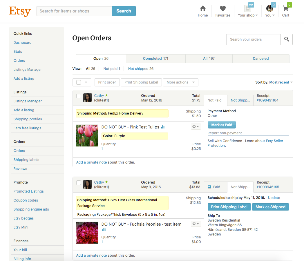
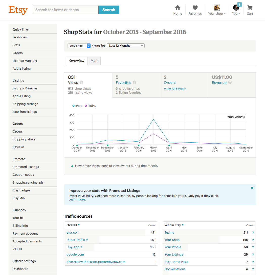
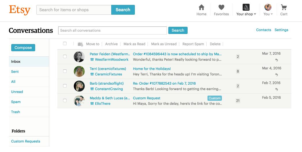
My team, Seller Onboarding & Activation, was one of the first to start working towards this new vision for seller tools. Our area of ownership for this initiative was the seller dashboard and seller tool navigation. Here is what we were starting with:
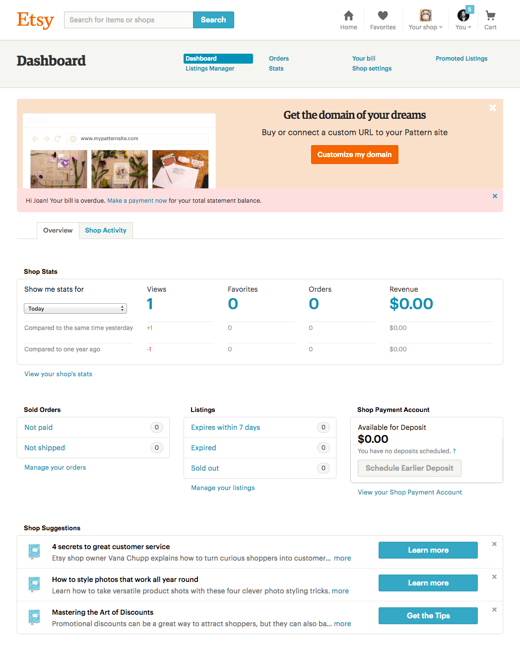

Rough, right? To get ourselves off the ground, we first had to understand what was working about the dashboard and navigation that sellers were currently using. In addition to digging into seller usage data, we researched other tool-based products and chatted with sellers about their habits. Almost every seller we talked to said they started their day by checking for new orders that came in from their various sales channels and combining these into one list that then informed their activities for the day. In the absence of a better task management system within Etsy, sellers had found a wide variety of tools to fill this need, often times linking several tools together to create a semi-automated order management to-do list system (such as Workflowy, Asana, and more basic tools like a text document and even paper and pencil).
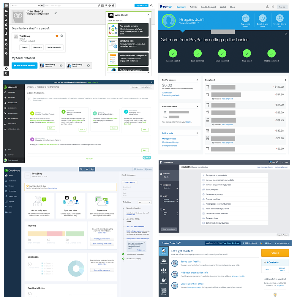
After these initial insights, the entire team (which consisted of myself, a product manager, 3 engineers, and a UX researcher) took part in a week long design sprint to ideate on the seller dashboard. Our objective was to create a prototype that turned the dashboard into shop management central; the place that sellers rely on to manage all aspects of their business. Based on early user research, we planned to focus our design sprint on the following areas:
- Task management / notifications - What do I need to do to manage my shop?
- Shop status - What is the current state of my shop?
- Channel activation - How do I add new sales channels?
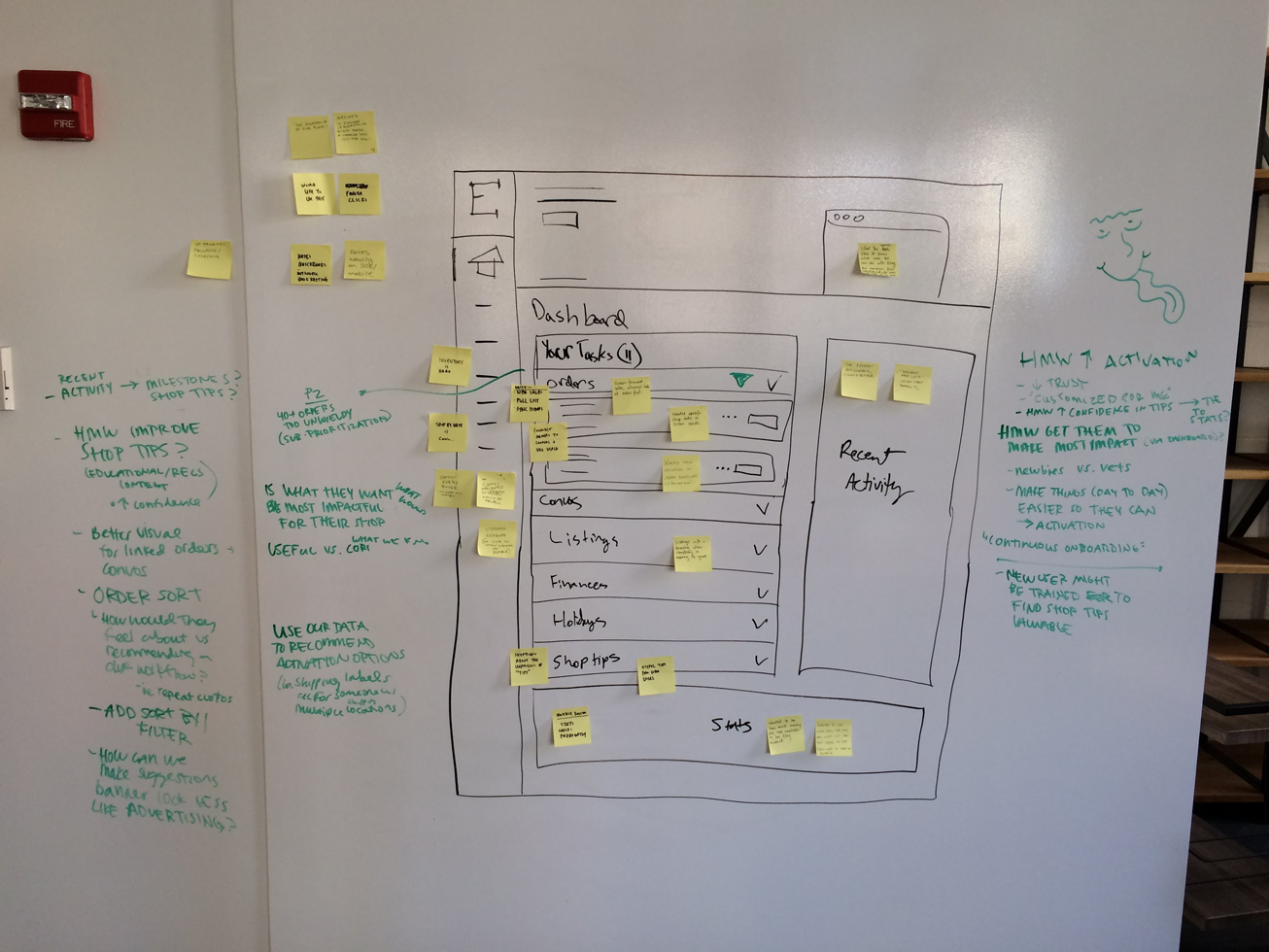
The schedule for our sprint looked like this:
- Day 1: Ideation
- Day 2: Sketching / deciding
- Day 3: Building
- Day 4: Building
- Day 5: Testing / building
- Day 6: Building
- Day 7: Testing / wrap
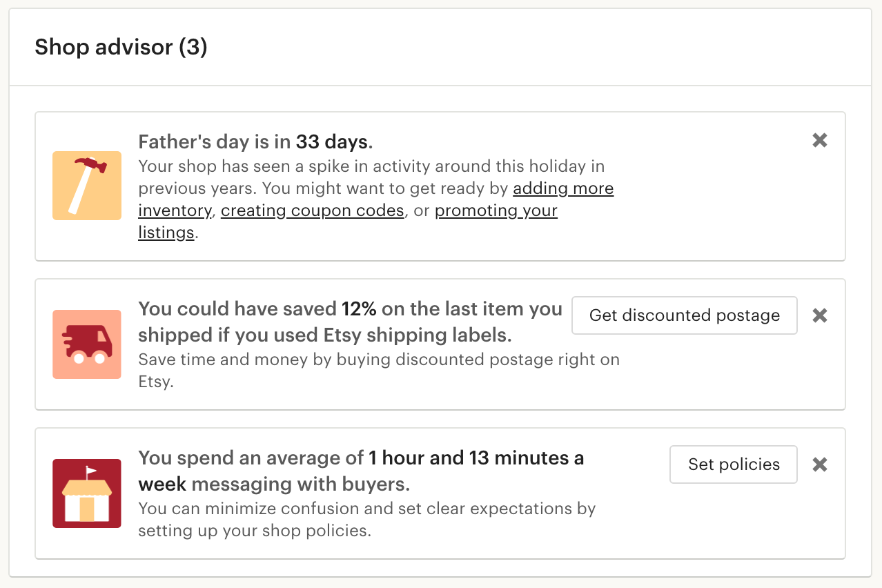
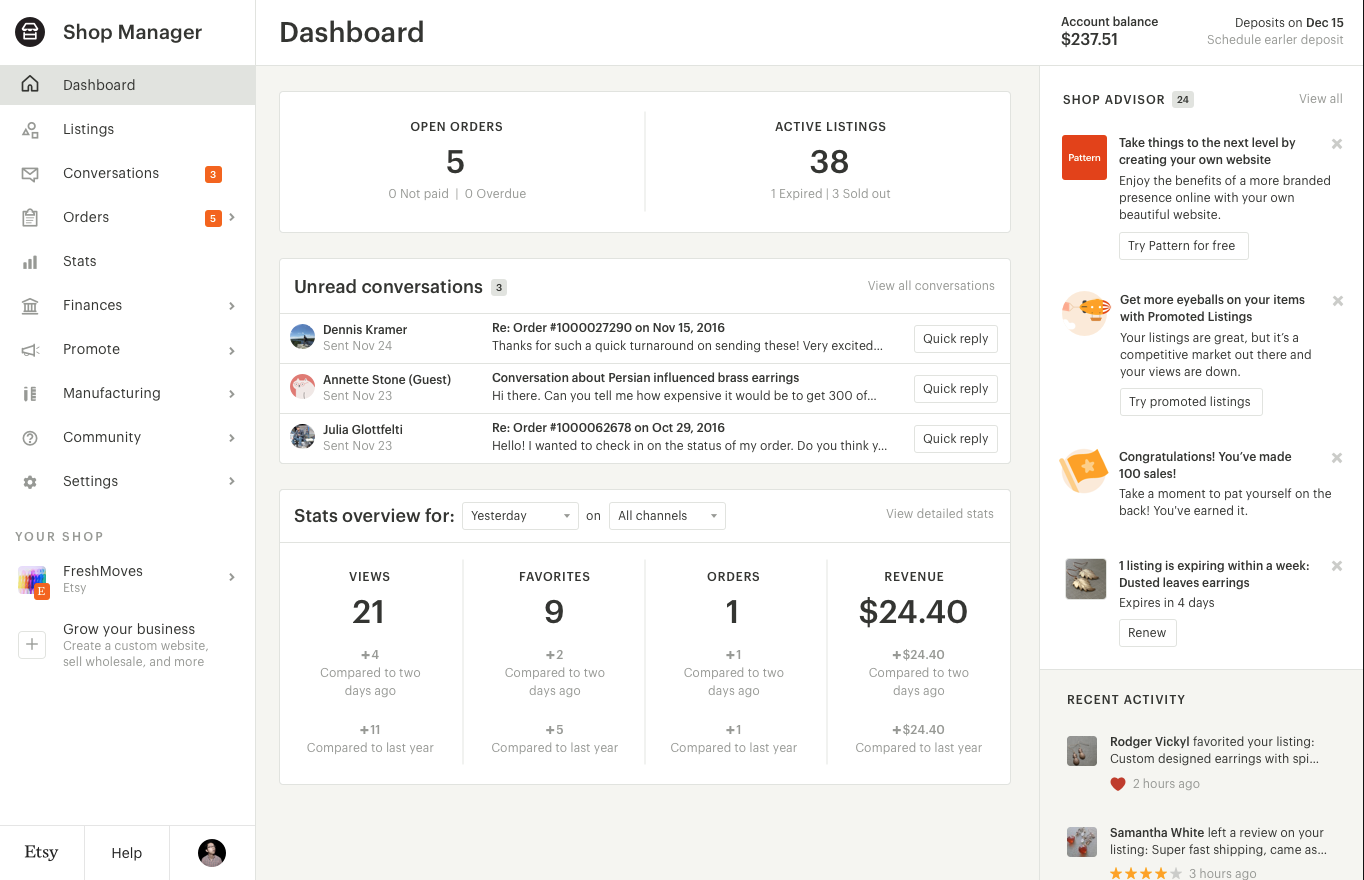
The first prototype we built introduced the concept of a fixed sidebar nav, and on the dashboard, the notion of a task manager and a shop assistant-type space that we called the "shop advisor".
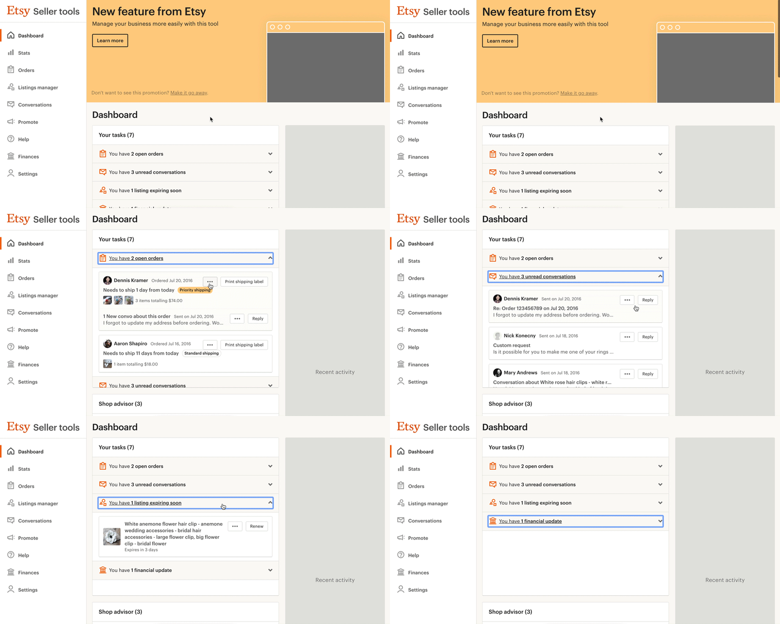
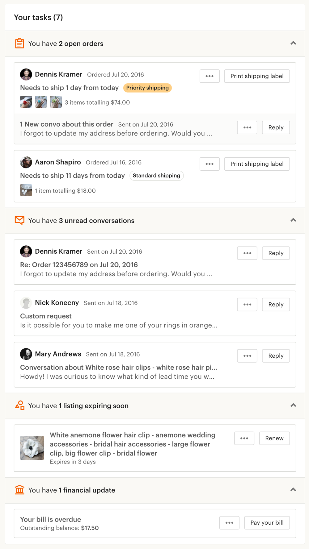
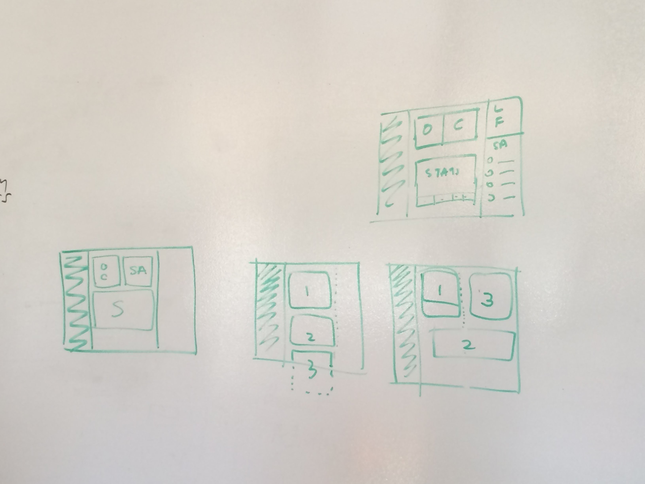
Most research participants were excited about the prototype. they saw value in the high-level synopsis of their shop and the consolidation of important business actions in one place. However, a few sellers thought that the dashboard seemed cluttered and overwhelming. As a result, we spent a bit of time thinking about layout and how to organize content in a prioritized order.
With regards to the shop advisor, time-sensitive, actionable, and hyper-relevant prompts resonated strongly with our participants. However, there was also some concern that not all shop advisor content would be relevant to their specific needs, and that it could be distracting and obtrusive.
While implementations of the shop advisor and task manager had room to improve, this initial rapid round of prototyping and research gave us the confidence we needed that we were heading in the right direction. To speed up progress, we split up the work on the dashboard and the work on the nav between two squads. My focus was on the dashboard, but I continued to work closely with the other squad that was responsible for the nav.
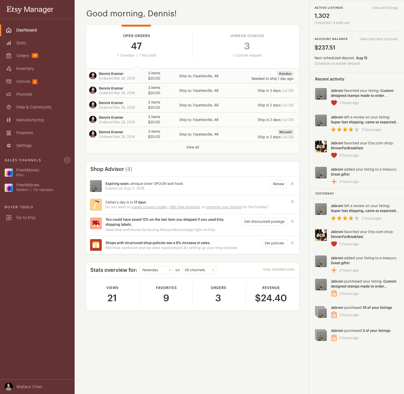
Part way through this project, with early functional versions of the nav and dashboard built out, we set up an open prototype group for sellers to manually opt themselves in to the new features. This allowed us to recieve ongoing feedback on what was or wasn't working for sellers with the nav and the dashboard. At that stage, the product looked like this:
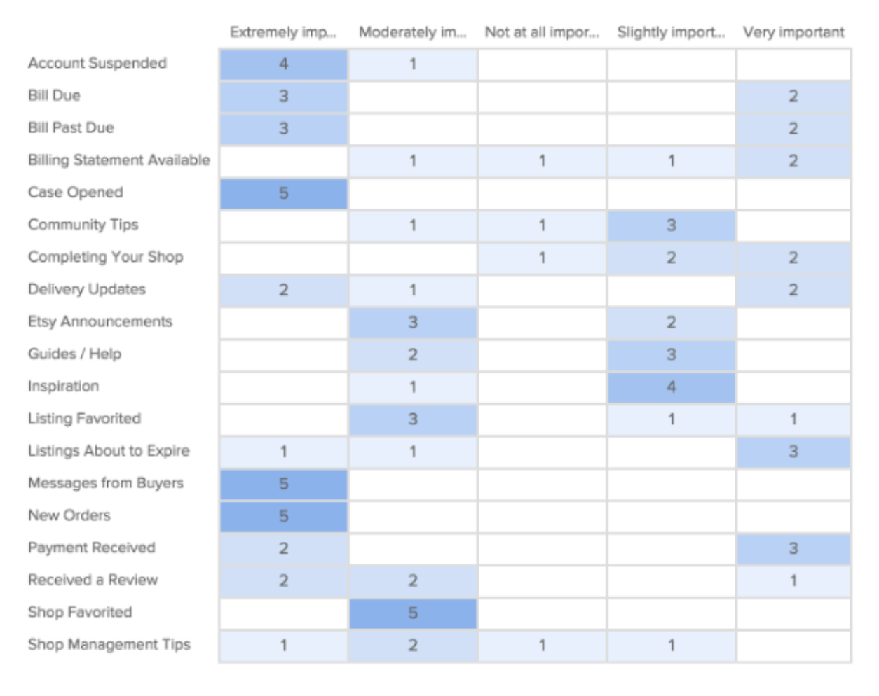
In the meantime, we were continuing to talk to sellers about the types of content that they would like to see in their shop advisor. We solicited sellers to partake in card sorting exercises to rank the importance of various notification types:
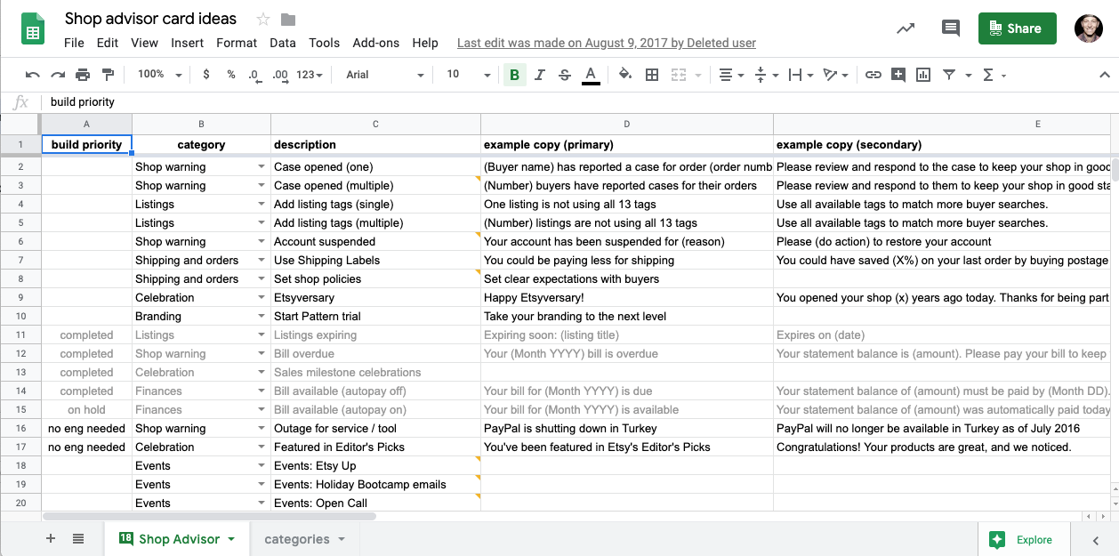
We also kept an ongoing list of potential shop advisor card types that could be beneficial to sellers, and tested out the potential value of these messages and actions:
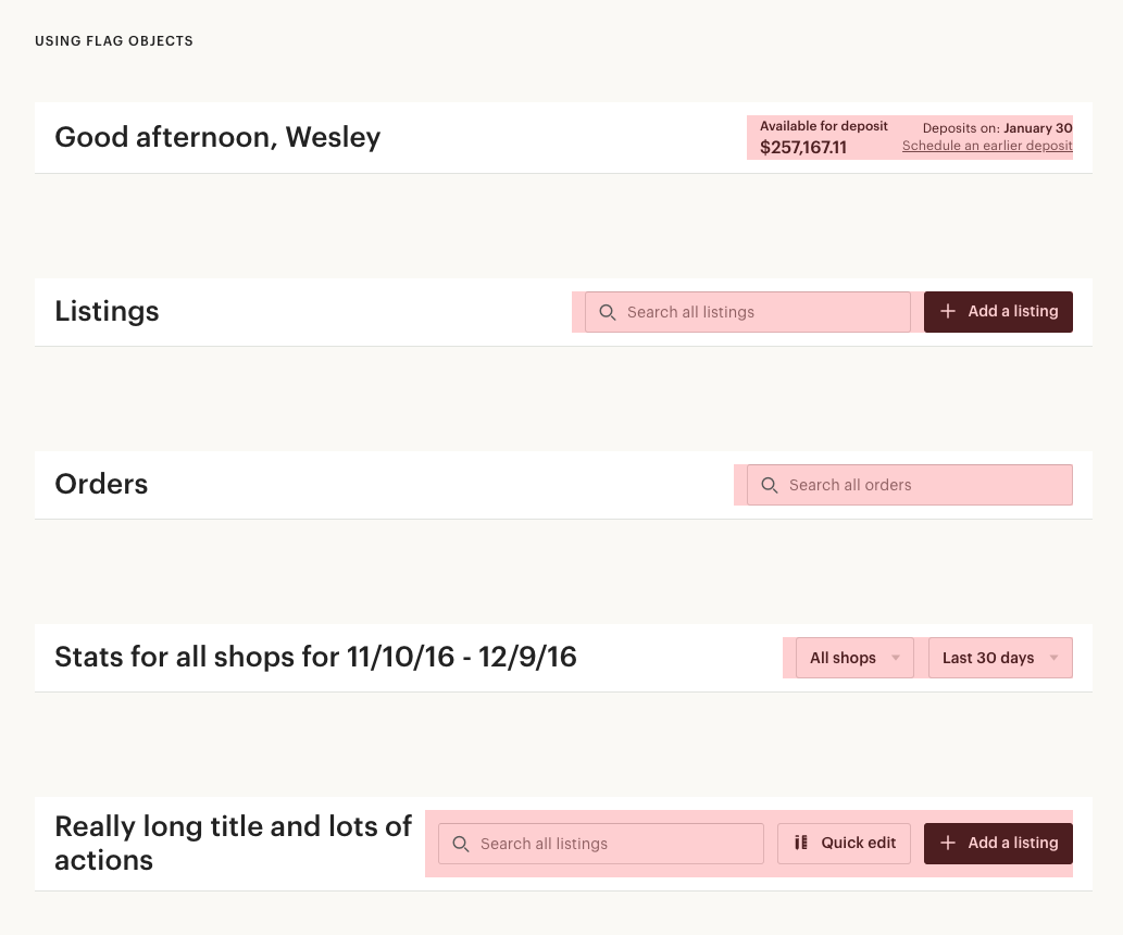
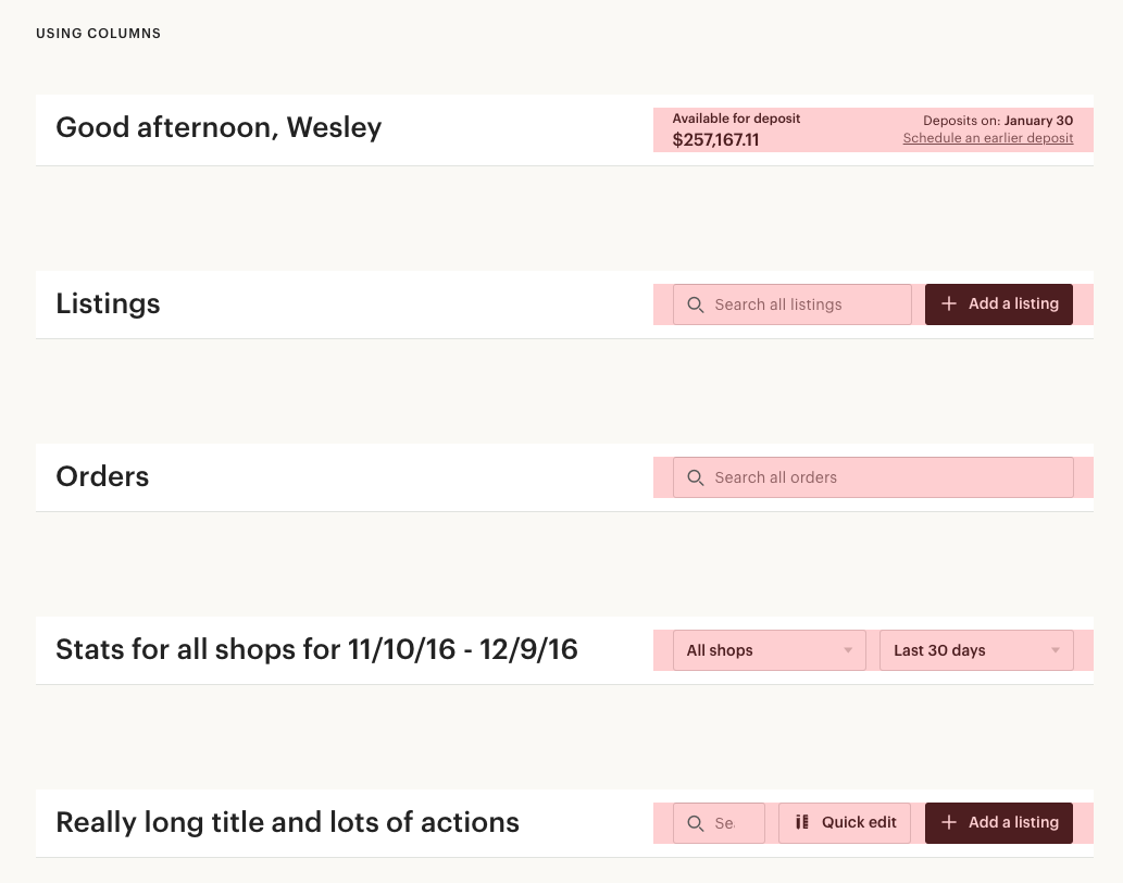
Around this time, teams that owned other tools throughout the seller experience were starting to think about how to modernize their spaces in pursuit of the Mission Control vision as well. It occurred to me that it would be beneficial to establish some consistent page title structure for all of these tools. After consulting with various teams about their needs, I built static prototypes to figure out how this title area should be built to accommodate various layouts:
Continuing to iterate based on our learnings from the open prototype, we arrived at a version of the dashboard and navigation that would set us up to reach the larger business vision for mission control, and was also effective at supporting our sellers right now.
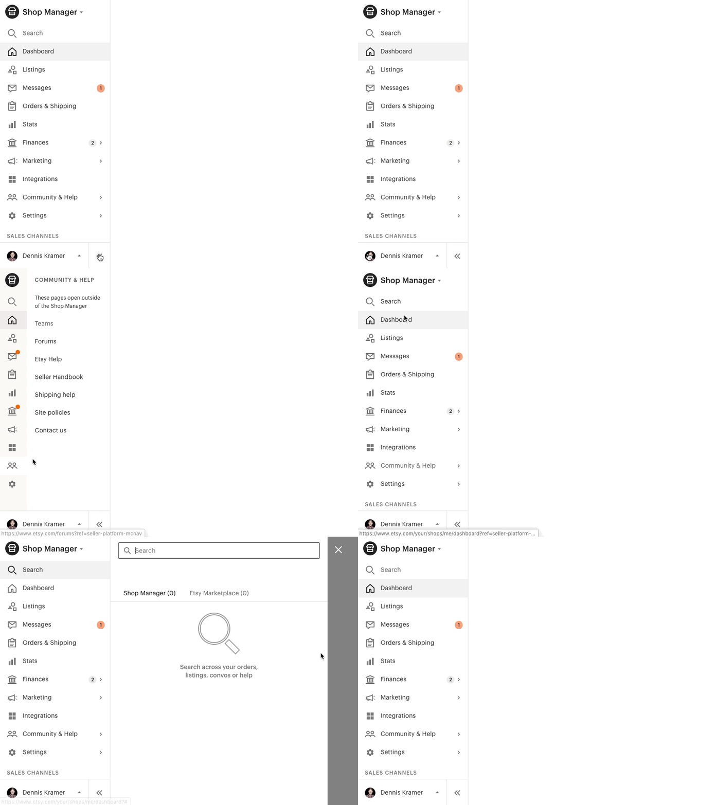
I worked closely with the engineers on both the dashboard and navigation squad, often writing the frontend code (CSS and JSX) to deliver experiences that felt fluid and intentional. This was particularly relevant for the nav, which required a secondary nav drawer:
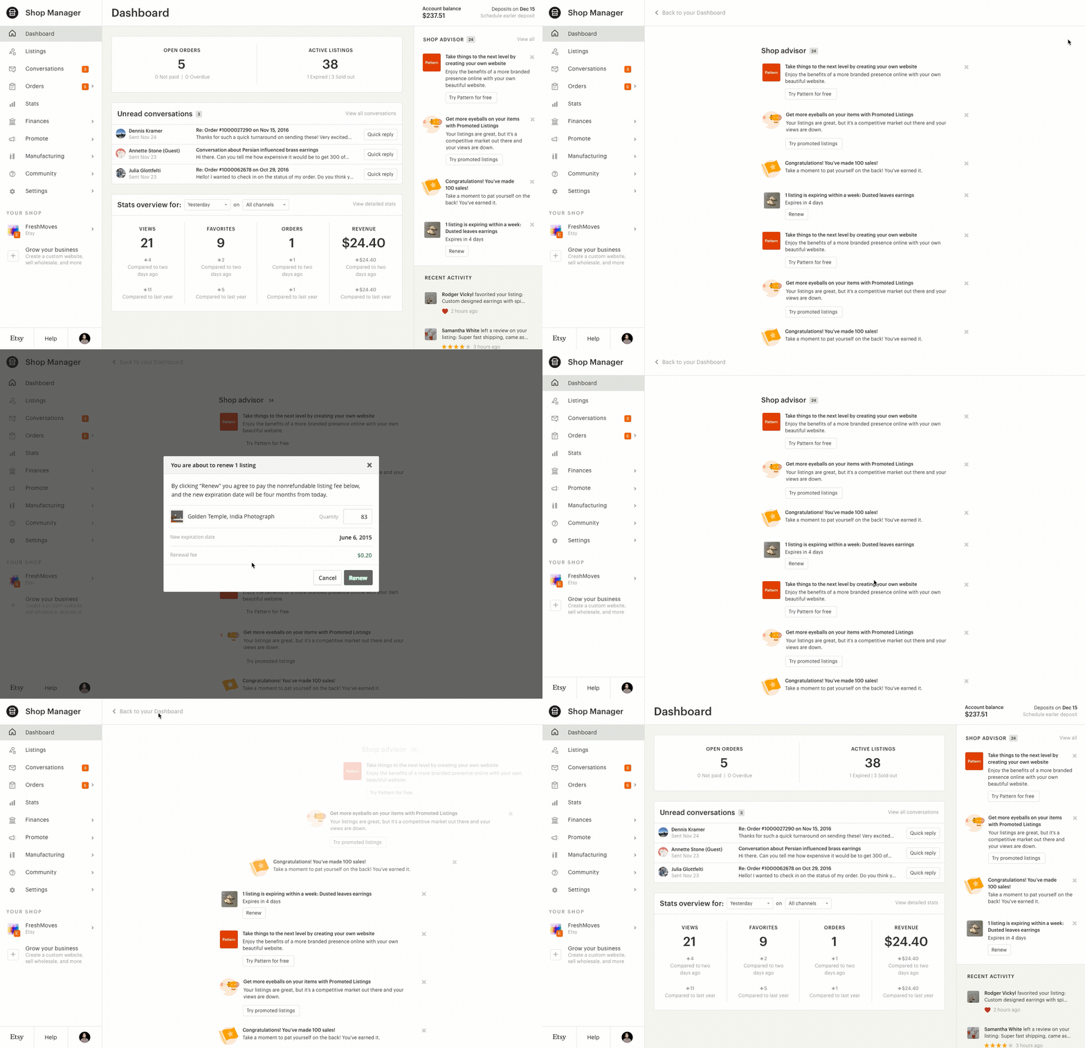
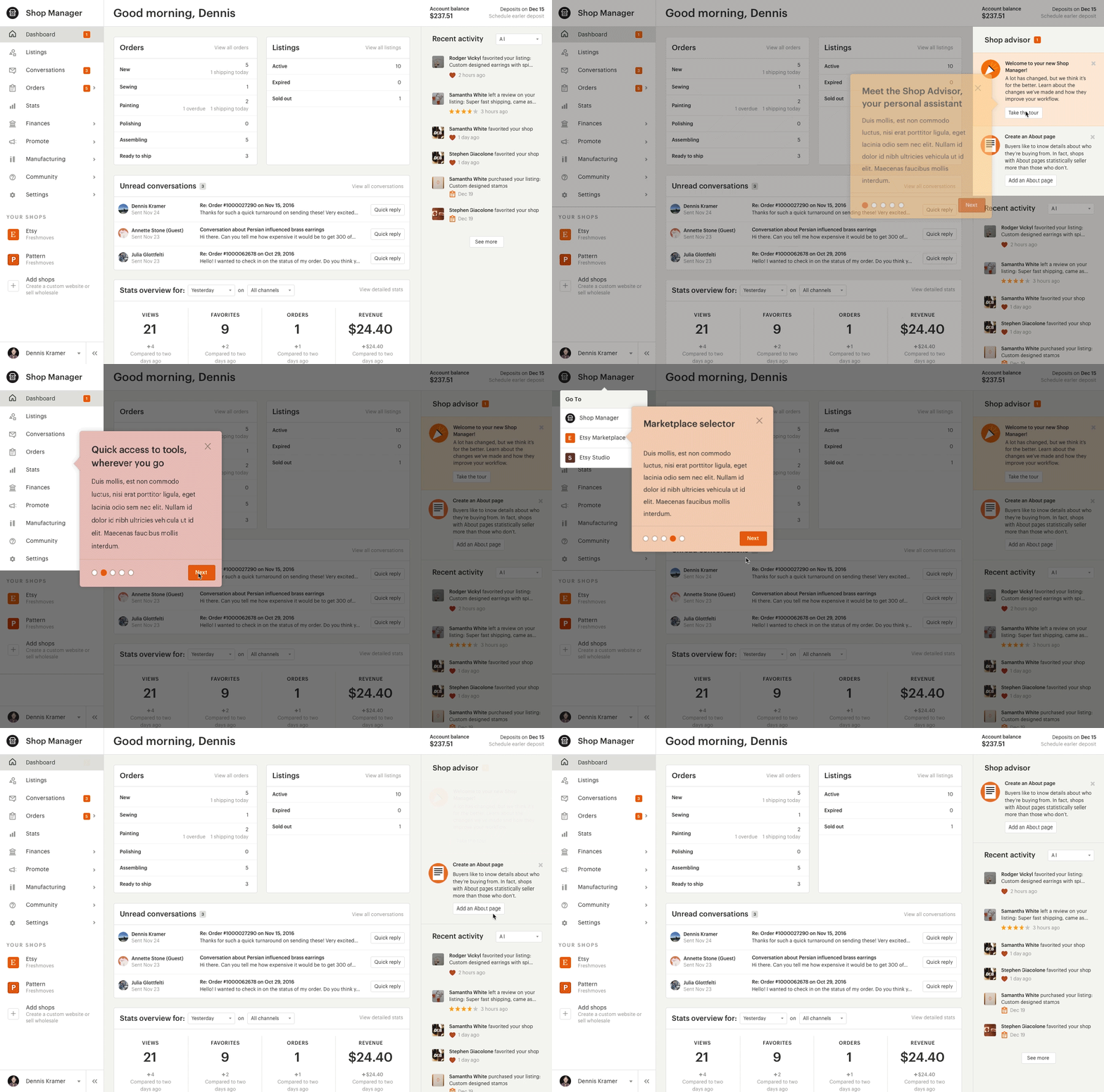
I also continued to prototype animation-heavy interactions for revealing more shop advisor content, and for introducing sellers to these new products by way of a tour. Again, I worked closely with engineers to build these out:
This project was a huge coordinated effort with a lot of different stakeholders, and put a lot of trust in myself and my team to pave the way for the future of seller tools. Although some major business decisions towards the tail end of this project ended up haulting the work to pursue Mission Control, I'm still proud of our effort and believe that we made a lot of strides towards building out better, modernized tools for our sellers.


